Product Hunt Launch Mistakes: Your Gallery Is Talking to the Wrong Person
A reused marketplace hero image underperforms on Product Hunt not because it's a bad image, but because it was built for a shopper who already speaks the language — a cold Product Hunt visitor needs a completely different sequence.
PPrashant Kumar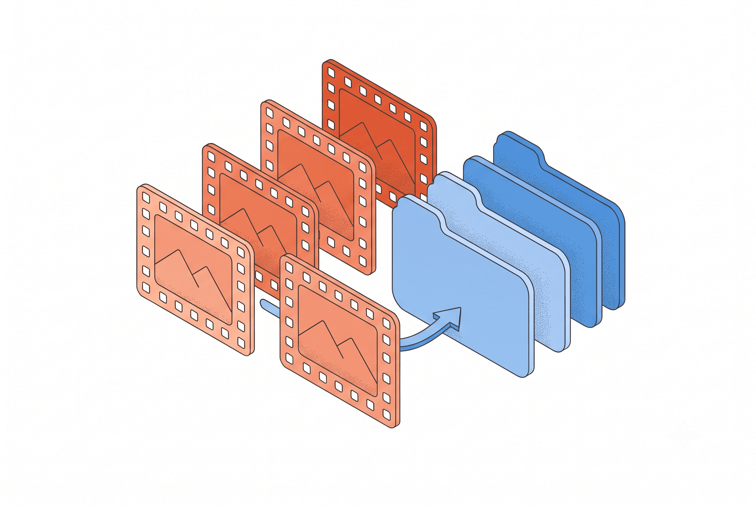
The thumbnail and the gallery are solving two different problems — the thumbnail decides whether someone clicks through from the feed, the gallery decides whether they stay once they've landed — and most teams only design one of them properly.
A shopper on your Notion Marketplace listing already knows what a template is for. They've bought two before, and they're comparing your grid layout against three open tabs. A Product Hunt visitor scrolling the daily feed usually doesn't have any of that. That's the actual reason a reused marketplace hero image underperforms on Product Hunt — not that it's a bad image, but that it was built for someone who already speaks the language.
That gap shows up first in the gallery, because the gallery is the one part of a Product Hunt listing where you get more than a single shot at the case — and it's worth getting right even if the backlink matters more to you than the launch-day sales number, since a weak gallery still costs you the traffic that backlink is supposed to convert. Product Hunt's own submission flow only requires two images before the gallery even displays — everything past that is optional. But most current launch guides converge somewhere between five and eight images, because that's roughly how many beats it takes to walk a cold visitor from "what is this" to "I get it, upvote."
Five clear screenshots do more work than one over-designed hero, and the reason is sequencing, not polish — the feature cards that actually stop someone mid-scroll never try to say everything in one image either. A team that composes one dense feature card for a marketplace listing — logo, tagline, three callouts, done — tends to bring that same density into image one on Product Hunt. On the marketplace, that's fine. The shopper already accepts the category and is evaluating fit. On Product Hunt, that same dense image is often the first time anyone's seeing what your product category even does, and it answers questions nobody's asked yet while skipping the one they actually have.
What five images are actually for
Spread across five to eight slots, the sequence has a job to do. Image one shows the outcome in under two seconds — not a feature, the result. Image two shows the core workflow, the thing a person would actually click through inside the product. Somewhere in the middle, a comparison or before/after earns its place if it's genuinely true, not staged for the launch. And at least one image should show range — that this is a maintained system, not a one-off — which carries more weight for a product with a company name attached than for a solo project, since "is this still going to work in six months" is a bigger part of the decision.
None of that needs more than one annotation per image. One arrow, one label, pointing at the thing that matters in that frame. Stack three callouts into a single screenshot and the eye doesn't know where to land first — the same failure as the over-designed hero, just repeated five times instead of once.
The thumbnail and the gallery are solving two different problems, and most teams only design one of them properly. The thumbnail is a square crop — 240×240 — and it decides whether someone clicks through from the Product Hunt feed at all. The gallery decides whether they stay once they've landed. Teams used to a single polished marketplace hero often crop that same image down for the thumbnail and lose the one detail that made it legible at that size, or over-invest in a flashy GIF thumbnail assuming animation is what wins the click. Less than a third of Product of the Day launches actually used an animated GIF thumbnail — a correctly cropped, high-contrast square consistently does the job on its own.
Where the mistakes actually repeat
Once the sequencing is right, most of what's left is composition discipline. The recurring failures across agency-built launches look like this:
- Uploading the same screen at different zoom levels. A second image that's just a tighter crop of the first wastes a slot that could've shown a different product moment.
- Skipping the browser frame on a web product. Without one, a screenshot reads as a flat design mockup rather than something someone can actually go use — the same gap a plain laptop-framed screenshot leaves on a marketplace listing, just showing up a day earlier, on launch day instead of the refresh.
- Letting the UI touch the edges of the canvas. Product Hunt's 1270×760 gallery frame is a 1.67:1 ratio — narrower than 16:9, wider than 4:3 — and content built for a different aspect ratio gets letterboxed on upload if it's not composed for this canvas from the start.
- Text that only reads at full size. If a screenshot depends on zooming to make sense, a label does that job instead.
- Inconsistent framing across the five images. Different padding, different background treatment, or a font size that shifts from slide to slide reads as five people working from five briefs, even when it's one team on a deadline.
There's a version of this mistake that's specific to agencies running more than one live listing: reusing a screenshot style tuned for a different product entirely. A card layout built for a dense Shopify app dashboard doesn't automatically translate to a simpler Notion template's Product Hunt gallery — the padding ratio and headline weight that read as clean on one product can read as cramped or empty on another, because the underlying screenshot carries a completely different amount of visual information.
That composition problem is exactly what a per-platform preset is built to solve — the same problem that shows up when a free mockup tool gets tested against what a listing refresh actually needs instead of just how nice it looks on a mood board. Product Hunt gets its own preset in List Pro's platform selection when generating a launch kit — headline size, screenshot placement, and annotation density are tuned for the 1270×760 canvas and a cold audience, rather than carried over unchanged from whatever composition worked on the marketplace listing.
If your team already has five product listings live, the temptation on launch day is to treat the Product Hunt gallery as one more export in the same batch job. It's worth the extra twenty minutes to build it as its own five-image sequence instead — one built for someone who's never heard of your product category, not someone already three tabs deep comparing templates.
What would the first image need to show if the person looking at it had never seen a product like yours before?
Related posts
Ready to build your own launch kit?
Generate feature cards, cover images, and launch videos for Product Hunt, Gumroad, and Shopify App Store — or start with a free tool, no signup required.