Your Notion Template Looks Fine. Nobody Knows What It Does.
A laptop-framed screenshot proves your product is real. It doesn't explain what it does — and that gap is costing agencies clicks on every marketplace refresh.
PPrashant Kumar
A device mockup only proves a product is real — it never explains what it does, and that gap is costing agencies clicks on every marketplace refresh. A feature card closes it by turning the screenshot into evidence for one specific claim instead of a photo with no caption.
The refresh is due Friday. Four products, one designer's backlog, and a client who wants proof the listing update happened before the invoice goes out.
You open the folder of new app screenshots, drop each one into a laptop frame, add a drop shadow, export. Twenty minutes, four products done. The product visual looks clean. Professional, even.
Then a teammate asks the question that ruins the afternoon: "What does this actually show?"
Nobody can answer without opening the app.
The Mockup Was Never the Problem. It Was Never the Answer Either
A laptop frame around a screenshot proves the product is real. It doesn't explain what the product does. For web-based micro SaaS and Notion templates, that gap matters more than it used to.
Product Hunt alone shipped 3,869 products in the first half of 2026. Average reception per launch fell from 190 upvotes in January to 144 by June. Weekly launch volume peaked near 900 in April before easing off, according to an Anysite analysis of the platform's launch data. Attention is spreading thinner across more listings, on Product Hunt and every marketplace that shares its structure — Notion, Shopify, Gumroad, all competing for the same four seconds of scroll.
A buyer scanning a marketplace listing isn't reading your description. They're pattern-matching thumbnails. A mockup and a plain screenshot pattern-match the same way: "here's an app." A feature card pattern-matches differently: "here's what it does for me."
That's the actual upgrade. Not prettier corners on the screenshot. A different job for the feature image.
What a Feature Card Does That a Mockup Can't
A mockup places your screenshot inside a device frame. That's the whole job. It's a container.
A feature card is built around one feature at a time. It takes the screenshot, identifies the part of the interface that matters — the button, the panel, the dashboard view — and labels it with a short callout. It pairs that with a headline pulled from what the feature actually does, not generic marketing copy. The screenshot stops being the whole image and becomes one deliberate piece of it.
For an agency running five product listings through 4 to 8 refreshes a year, this is where the designer time actually goes. Anyone can wrap a screenshot in a frame in under a minute. A feature card that explains one real workflow takes longer.
Designer pricing for that kind of card usually runs ₹5,000 to ₹15,000 per refresh, if you're paying per product. That cost is the reason most agencies default back to mockups under deadline. Not because mockups communicate better. Because they're fast, and fast wins on a Friday.
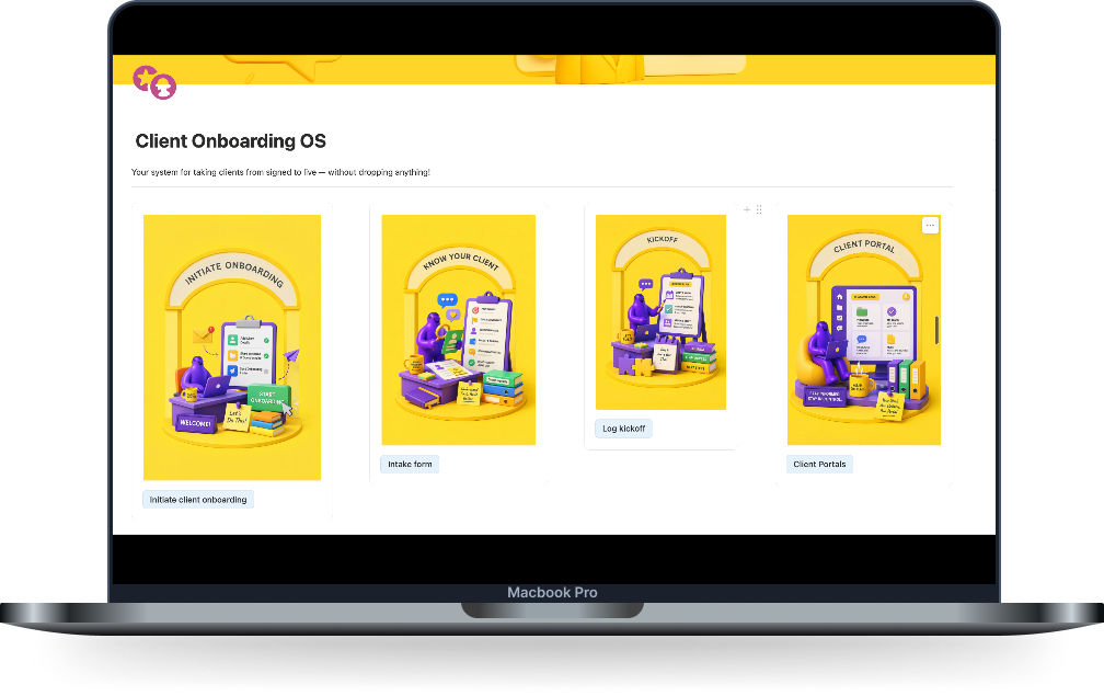 A mockup: proves the product is real. Doesn't say what it does.
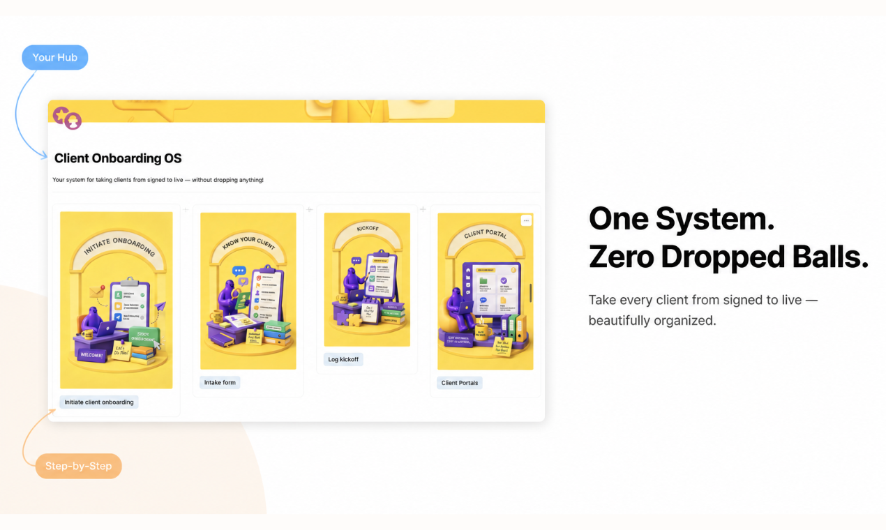 A feature card: the same screenshot, now labeled with what it actually does.
Where This Actually Shows Up in a Refresh Cycle
Picture the client review call. You're walking through the new listing images for their Client Onboarding OS template. The mockup slide gets a nod — looks nice — and then someone asks what the "Kickoff" screen actually automates. You're now narrating a feature image that was supposed to answer that on its own.
A feature card built around that same screenshot answers it before the question gets asked. The callout points at the kickoff checklist. The headline states what happens when a client hits that stage. The client review moves to the next slide instead of stalling on an explanation.
Multiply that across five products and a marketplace listing page that competes against hundreds of new entries every month. The gap between "looks done" and "explains itself" is the whole difference in whether a scroll turns into a click.
The Web App Gap Nobody's Solved Well
Mobile app-store screenshots solved this years ago. Most App Store and Play Store listings now use annotated callouts as the default, not the exception. Web-based micro SaaS never got the same tooling. Your options have been a plain screenshot, a mockup, or a designer's queue.
That's the gap a screenshot beautifier alone doesn't close. Beautifying a screenshot makes it sharper. It still doesn't tell a buyer what they're looking at.
Feature cards close that gap for web products specifically — Notion Marketplace listings, Shopify App Store submissions, Gumroad product pages, Monday.com app listings. Each platform has its own dimensions and its own expectations for how much a first image needs to communicate. That's exactly where a template-driven mockup starts to show its limits.
What to Actually Do With Your Next Refresh
Before your next listing update goes out, pull one screenshot that's currently sitting in a mockup frame and ask what it's actually explaining. If the honest answer is "that the app exists," it's a mockup doing a feature card's job badly.
You don't need to rebuild every image at once. Start with the one feature on each product that gets asked about most in client calls or support threads. That's the one worth turning into a proper feature card first.
ListPro's Feature Card tool handles this for teams managing multiple web-app listings. One screenshot and a short feature description go in. A labeled feature card comes out, sized correctly for whichever marketplace you're shipping to next — Notion, Shopify, Gumroad, or Monday. No re-briefing a designer on the same product for the third time this year.
The mockup still has a place. A clean device frame is still the fastest way to prove a product is real. It's just not the tool for proving what it does. That's a separate job, and on the next refresh, it's worth treating it like one instead of folding it into the same twenty minutes as the frame and the shadow.
Related posts
What Notion Marketplace's Grid Actually Rewards — And What It's Quietly Costing Your Other Listings
Why Your Gumroad Listing Isn't Converting (And How to Find Out Which Part Is Broken)
Startup Explainer Videos: What a $3K Agency Is Actually Charging For (and How to Skip It With AI)
Ready to build your own launch kit?
Generate feature cards, cover images, and launch videos for Product Hunt, Gumroad, and Shopify App Store — or start with a free tool, no signup required.