10 Feature Cards That Actually Explain the Feature — And What They Have in Common
Ten feature cards that actually got someone to stop scrolling share one thing before you've even read the headline: none of them try to explain more than one thing, and the screenshot gets more room than everything wrapped around it, combined.
PPrashant Kumar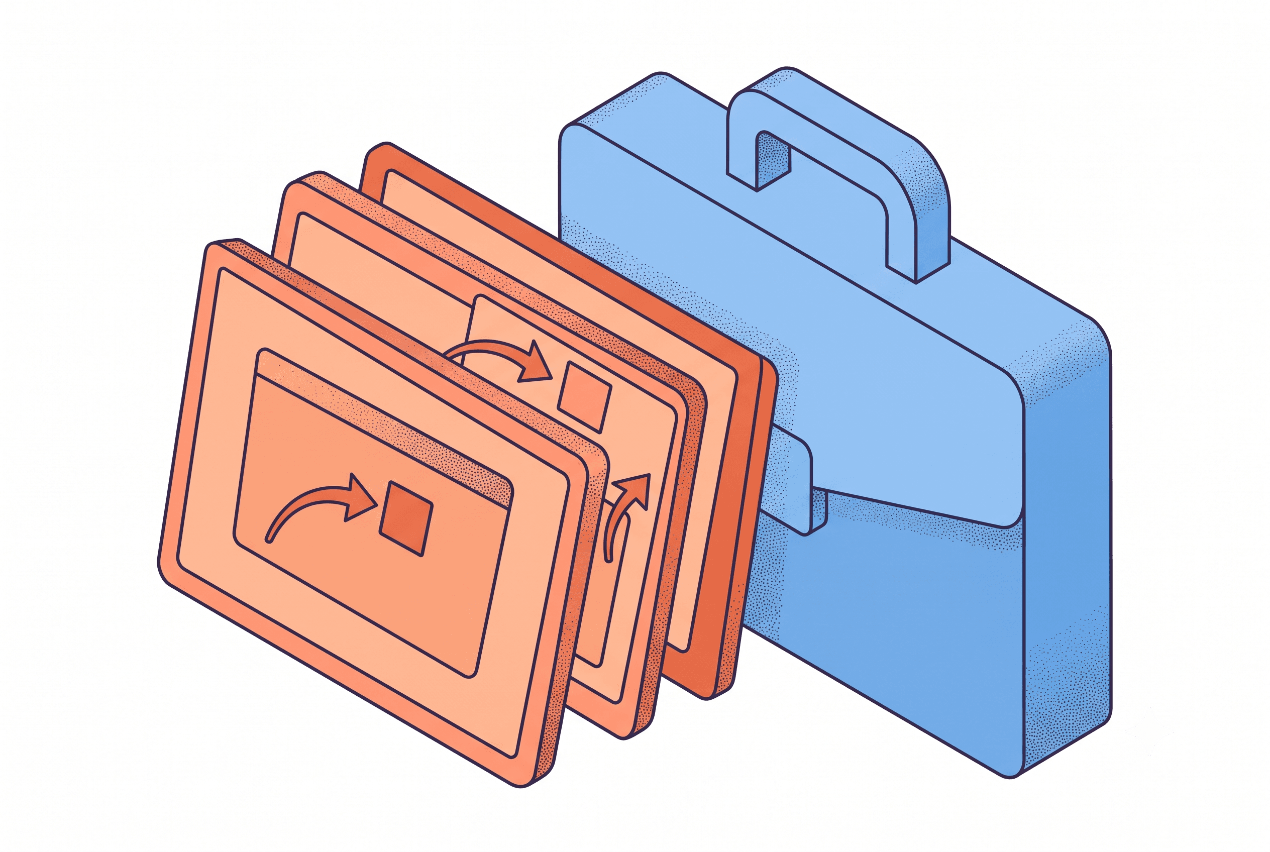
A single strong feature card is a design exercise — five strong cards that all belong to the same visual system is a retention strategy, and one inconsistent card in a five-product catalog reads as neglect even if the other four are excellent.
Pull up ten feature cards from ten different SaaS products, Notion templates, and Chrome extensions that actually got someone to stop scrolling — and before you've read a single headline, a pattern shows up. None of them try to explain more than one thing. And most of them give the screenshot more room than everything wrapped around it, combined.
The restraint isn't a style choice. It's the mechanism that makes a card explain anything at all.
For a team running five or six live listings, that's the opposite of the instinct. A listing image feels expensive to touch, so when someone finally sits down to refresh one, the impulse is to make it earn that time — cram in the headline, the subhead, a badge, two callouts pointing at different parts of the UI. The card ends up trying to sell the whole product instead of proving one thing about it. Here's what the ten cards that actually work do instead, and why it holds up across a whole catalog, not just one product launch.
1. One feature, one card
The strongest cards resist the urge to also justify the pricing or the onboarding. A dashboard card shows the dashboard doing one specific thing — filtering by owner, say — and stops. If a product needs to make three points, that's three feature cards, not one card working overtime.
2. The screenshot is the argument, not the backdrop
Weak cards treat the screenshot as decoration behind a big headline. Strong ones let the actual product interface carry most of the visual weight — the copy exists to point at what's already true in the screenshot, not to substitute for it.
3. The headline finishes a sentence the screenshot started
"Filter by owner in one click" only works because the screenshot shows the filter mid-click. Read the headline without the image and it should sound half-finished — that's the sign the two are doing one job together, not two separate jobs.
4. One callout, maybe two — never a scatter of arrows
Gallery-prep guides for Product Hunt launches are blunt about this: one arrow or label pointing at the main feature is usually enough, and stacking three dilutes the focal point instead of adding information. The same logic holds for a Notion Marketplace listing image or a Shopify App Store card — a viewer's eye can follow one line, not three at once. It's also the exact line that separates an annotator from a plain beautifier tool, which is worth knowing before you standardize your team's toolkit — see which category of screenshot tool actually survives a listing refresh.
5. Padding that keeps the UI from touching the edge
The cards that read as designed rather than cropped almost always leave 10–20% breathing room around the screenshot. Products that skip this step end up with a UI that looks compressed against the canvas — a small detail, but it's the fastest visual tell that a listing image was rushed.
6. A frame, when the product is a web app
A raw browser screenshot without any framing reads as a flat mockup rather than a live product. The cards that work almost always sit the screenshot inside something — a browser chrome, a device outline — that signals "this is a real, working thing," not "this is a design file." That said, a mockup only proves the product exists; it doesn't explain what it does — that's a different job, and it's the one a feature card is actually built for.
7. First image is the product working, not the settings screen
This is the one agencies backslide on most, because a settings or config screen is often the easiest screenshot to grab on a deadline. But a settings page looks like every other settings page. The first card in a gallery has to show the product doing its most valuable thing, not how someone configures it.
8. Consistency is the actual differentiator across a catalog
A single strong card is a design exercise. Five strong cards that all belong to the same visual system is a retention strategy. Buyers browsing a Notion Marketplace category — which now runs past 30,000 templates — are pattern-matching for polish across your entire storefront before they open a single listing; the grid renders your thumbnail before it renders anything else. One inconsistent card in a five-product catalog reads as neglect, even if the other four are excellent.
9. The copy respects a four-second read
Nobody studies a feature card. Research on first impressions puts the window at roughly fifty milliseconds for a viewer to form an aesthetic judgment, and that snap reaction tends to stick regardless of what follows — which means a headline that needs a second read has already lost the moment it needed to win.
10. The card earns its place without needing the rest of the listing
The best test for any single card: does it make sense completely on its own, out of context, as a thumbnail in a crowded grid? If it needs the surrounding listing copy to land, it's not doing its job yet.
None of these ten cards were generated in one shot and shipped. They're the result of someone deciding, deliberately, what not to include — which is a harder discipline to hold onto when you're maintaining five listings on a Tuesday between client deadlines than when you're polishing one for a single launch, and it's a different discipline than what actually survives a multi-product listing refresh when you're grabbing a free tool under deadline. It's part of why List Pro's own feature card tool defaults to giving the screenshot roughly two-thirds of the canvas, not half — so restraint is the starting point of every card, not a decision someone has to remember to make on refresh number four.
If your team is auditing your own listings this quarter, count the callouts on your last five feature cards before you touch anything else. That number alone tells you more than a full redesign brief would.
Related posts
Ready to build your own launch kit?
Generate feature cards, cover images, and launch videos for Product Hunt, Gumroad, and Shopify App Store — or start with a free tool, no signup required.