How to Design a Feature Card That Doesn't Look Like Sticky Notes
Overexplaining one feature reads as under-designed, not thorough — one callout on the exact thing worth showing beats four arrows proving you didn't finish deciding.
PPrashant Kumar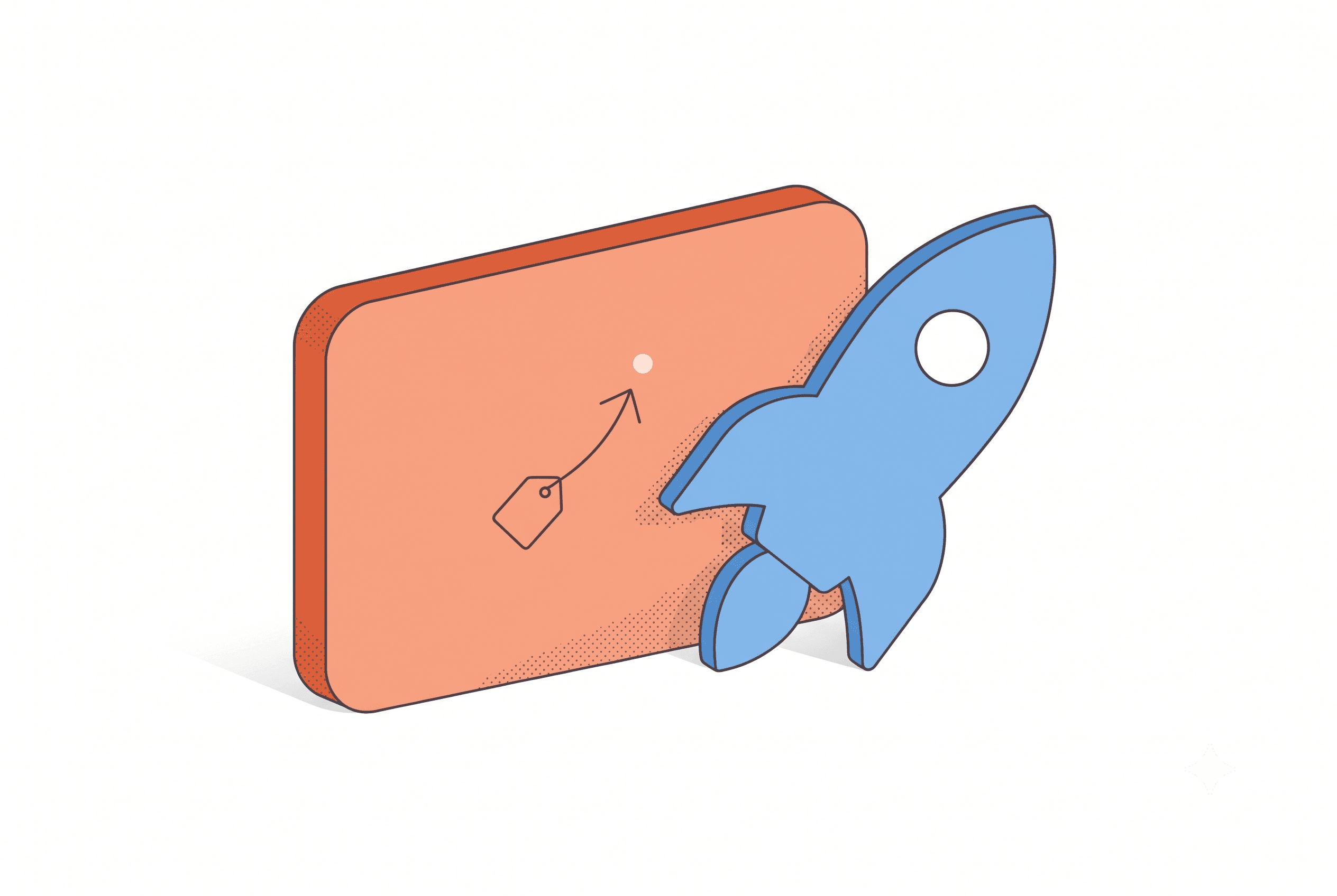
The card that gets a second look is almost never the one that tried to explain the most — it's the one that made exactly one thing unmissable.
A feature card that looks amateur almost never has bad design on it. It has too much confidence in how much a two-second glance can actually absorb.
Overexplaining one feature reads as under-designed — it doesn't read as thorough, no matter how much work went into it.
Here's the trap. You've got one feature, and you want the card to prove it's a real, considered thing you built — not a half-baked toggle you shipped the night before. So you add a callout for the main action, then one for the setting that controls it, then one for the small icon that confirms it worked, then one more because the card still has open space and open space feels like you didn't finish. Four arrows later, the card looks busy instead of finished. And a busy card is exactly what a rushed one looks like — which is the opposite of what you were going for.
The actual rules a professional feature card follows aren't a style choice. They're mechanical, and they hold regardless of how much you have to say about the feature.
One callout per idea — not one callout per thing that's technically true
A screenshot with four labels doesn't prove four things at once. It proves zero things clearly, because a scrolling visitor's eye doesn't know which one to land on first, and they're not going to spend the time deciding. Working memory research backs this harder than most people assume — Miller's famous "seven plus or minus two" got revised down by Cowan in 2001 to something closer to four chunks before recall breaks down, and that's someone actually trying to remember something. Nobody scrolling a Product Hunt gallery is trying. One callout, one idea, and you're already ahead of most of what's in that feed.
Arrow curvature toward whitespace, not toward more of your UI
Picture the difference between an arrow that curves from the label into open space beside your button, and one that has to cross a sidebar and two other icons to get there. The first one reads before the viewer even consciously processes it. The second forces them to parse everything in its path first — so your annotation is now competing with your own interface for attention. If your screenshot doesn't have clean space near the feature, crop tighter or reframe the shot. Don't route the arrow through the noise and hope it still lands.
Label before explanation, every time
"Auto-save," then a short line under it — not a line that starts with "This means your work..." and buries the actual label in the middle of a sentence. The label is what a scanning eye picks up in the first half-second. The explanation is only for the person who's already decided to slow down and read.
Take an actual before-and-after. Say the feature is a keyboard shortcut you added to your Chrome extension. The "before" card has a callout on the shortcut trigger, another on the settings panel where you customize the keys, a third on a small badge that confirms the shortcut fired, and a fourth on the icon in the toolbar. Every one of those is a real, accurate thing your extension does. But someone glancing at the card for two seconds doesn't come away thinking "fast keyboard shortcut" — they come away trying to parse four separate claims at once, and they scroll past before finishing. The "after" card keeps one callout: on the shortcut trigger itself, labeled "One keystroke," with a short subline naming what it replaces. The settings panel and the confirmation badge stay visible in the screenshot — proof it's real — without fighting for the same two seconds of attention.
None of these rules ask you to say less about your feature than it deserves. They ask you to put the second, third, and fourth thing you want to say somewhere other than a competing callout — the subline, the next screen of your gallery, your launch comment. One card, one idea, isn't a limitation. It's the only version of the card that survives a two-second scroll.
The card that gets a second look is almost never the one that tried to explain the most — it's the one that made exactly one thing unmissable.
If you've ever spent an hour the night before launch trying to figure out where an arrow should physically point on your own screenshot, that's the actual bottleneck — not your design taste, just the guesswork of picking coordinates by eye with no one to sanity-check it. That's close to the exact problem List Pro's feature card tool exists to solve: it reads your screenshot and your feature description together to decide where an annotation should anchor, instead of you eyeballing pixel positions at midnight with a mouse and a prayer.
For what actually separates a card that gets a screenshot to stop someone mid-scroll, ten feature cards worth studying before you build yours is a good fifteen-minute detour. If you're still deciding between a plain device mockup and something annotated for your launch page, here's where each one actually earns its place. And if you're comparing tools at 11pm trying to figure out which one won't just slap a gradient on your screenshot and call it done, this rundown of what each tool category actually does will save you a few tabs.
Open your current draft and count the arrows. If it's more than one, ask which arrow you'd keep if you could only keep one — that's usually the card you should have shipped.
Related posts

Ready to build your own launch kit?
Generate feature cards, cover images, and launch videos for Product Hunt, Gumroad, and Shopify App Store — or start with a free tool, no signup required.