It's 11 PM, Launch Is at Midnight, and Your Screenshot Still Looks Like a Screenshot
A laptop mockup just proves your product exists. At midnight, the night before launch, what actually moves the needle is a feature image that explains what it does.
PPrashant Kumar
A laptop mockup only answers 'is this real?' — a question every Product Hunt visitor already assumes yes to. What actually moves someone past that is a feature card that answers 'what does this do for me?' before they have to ask.
You've got the laptop frame dropped in. Gradient background behind it, soft shadow under the corner. It looks like every other gallery image you scrolled past tonight while checking what tomorrow's competition looks like.
You built the thing alone. Nobody's going to explain the dashboard for you in the comments. The app screenshot has to do that by itself, and right now it's just a product visual of your app sitting on a fake desk.
Nobody's Confused About What a Laptop Mockup Is. That's the Problem.
A device frame answers one question: is this a real product? Every gallery on Product Hunt already assumes yes. The frame doesn't move anyone past that.
Launch volume on Product Hunt peaked near 900 products in a single week in April 2026. Average upvotes per launch dropped from 190 in January to 144 by June. That's according to an Anysite analysis of first-half 2026 launch data. More products, thinner attention per product — and a solo launch with no existing audience is the one most exposed to that math.
A buyer skimming the gallery at 12:01 AM isn't going to click through five images to understand your feature set. They're deciding off the first one or two. A mockup shows them a laptop. A feature card shows them what happens on the screen inside it.
What You're Actually Missing Isn't Polish
You're not short on gradient backgrounds or device frames — free mockup tools cover that fine. What you don't have is a way to point at the one thing your product does and say it out loud inside the feature image itself.
A feature card does that specifically. It takes your screenshot and finds the part of the UI that matters — the automation toggle, the dashboard chart, the onboarding step. It adds a callout with a short label pointing right at it, and a headline above it, pulled from what that feature actually does. The screenshot becomes evidence for a claim instead of a picture with no caption.
That's the difference between "here's my app" and "here's the thing that makes my app worth trying." Mobile app screenshots figured this out years ago. Nearly every serious App Store listing uses annotated callouts now. Web-based tools launching on Product Hunt, Gumroad, or Tiny Launch mostly still don't, because nobody built the equivalent for a browser screenshot until recently.
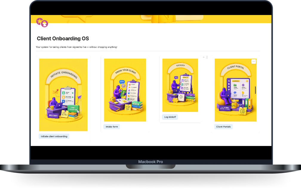 A mockup: proves the product is real. Doesn't say what it does.
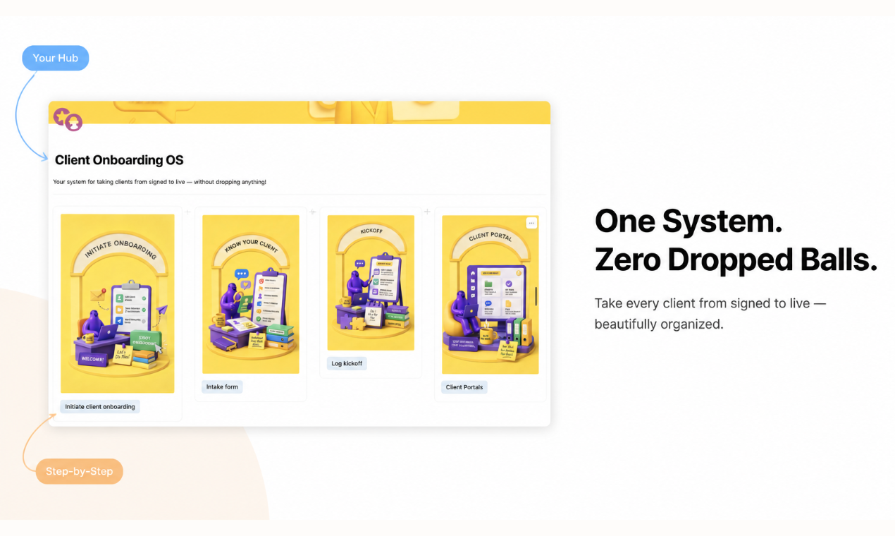 A feature card: the same screenshot, now labeled with what it actually does.
Why This Matters More When You're Solo
You don't have a designer's queue to drop this into. You have tonight, and whatever's already open on your screen.
That's exactly why the default has been a plain screenshot, a quick mockup, or a generic screenshot beautifier pass. Not because any of those communicate well. Because all three are things you can finish alone in twenty minutes, at 11 PM, with no one to hand it off to.
The problem is the twenty-minute version and the thoughtful version look identical to a stranger scrolling past at midnight. A laptop frame doesn't signal effort anymore — everyone in the gallery has one, on every marketplace listing next to yours, from the well-funded launch to the solo one.
What does signal something: an image that answers "what does this do" before the buyer has to ask it. That's not a design skill you're missing. It's a different kind of product listing image, built around one feature and one claim instead of one screenshot and one shadow.
The first image in your gallery is doing more work than the rest combined, whether you're on Product Hunt, Gumroad, Tiny Launch, or Uneed. It's the one a buyer sees before they've decided to look at anything else. A generic mockup asks them to keep scrolling on faith. A feature card gives them a reason before they've had to ask for one.
The Actual Fix, the Night Before
Pick the one feature you'd explain first if a friend asked what your product does. Not the whole feature list, just one thing. Maybe it's the automation that saves people an hour a week, or the one dashboard view that makes the whole product click. That's the image that needs to be a feature card, not a mockup, because that's the image doing the actual selling.
Everything else in your gallery can stay simple. A clean mockup for the second and third images is fine — nobody expects six feature cards from a solo launch. It's the first image, the one deciding whether anyone clicks through to the rest, that's worth the extra ten minutes.
ListPro's Feature Card tool is built for this exact moment. Solo, no design background, one screenshot and a short description of the feature. It composes the callout, the headline, and the layout automatically, sized for whichever platform you're launching on tonight. The free tier gets you one card to test the idea before you commit to the rest of the gallery.
Keep the mockup for your landing page hero if you want. It still does that job fine, and nobody's asking it to do more there. For the gallery image someone decides on in four seconds, give them something that explains the product, not just a photo of it existing.
That one swap, on that one image, is usually enough to change what the next four seconds decide. It's a small edit for midnight. It's the one that actually matters.
Related posts
Ready to build your own launch kit?
Generate feature cards, cover images, and launch videos for Product Hunt, Gumroad, and Shopify App Store — or start with a free tool, no signup required.